Free templateUser flow diagram
Sign-up user flow
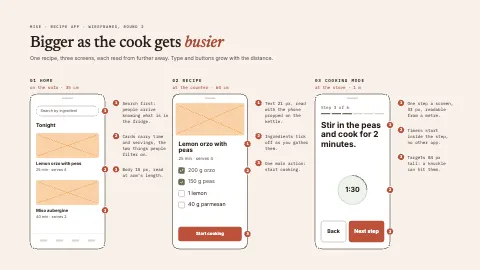
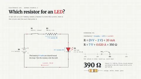
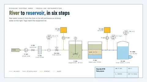
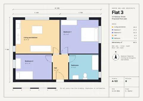
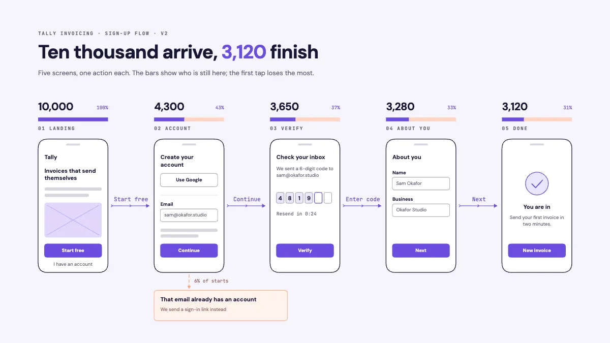
Five wireframed phone screens from landing to done, each with the action that moves you on and a funnel bar of who is still there.
Free. It opens in the Motionix editor as your own copy.
Download the pictureWebP, 1200 × 675, free to use. To change the words or colours, open it in the editor.
- Size
- 1920 × 1080 px
- Pages
- 1
- Motion
- Yes, plays live and in GIF or video
- Category
- Technical
What it shows
- Wireframed screens
- A funnel drawn over the flow
- The branch below the happy path
Good for
How to use it
- Open the template. It becomes a project in your account.
- Change the words, colours and pictures. Every part is an ordinary shape, line or text box.
- Press Play to watch it build, then present it or export it.
What is a user flow diagram?
A user flow diagram shows the path a person takes through a product to complete one task, such as signing up, screen by screen and action by action. Each step is a screen or page, each arrow is the action that moves the person on, and branches show what happens when something goes differently, like an email that already has an account. Adding drop-off counts turns it into a funnel.
When it helps
- A product designer planning a new sign-up flow before drawing detailed screens.
- A product manager finding the step where most new users give up.
- Briefing developers on every screen, action and error state a flow needs.
- A design review comparing the current flow with a shorter proposal.
Tips
- Sketch low-fidelity screens instead of boxes with titles. A rough wireframe shows how much each step asks of the user; a box labelled "Verify" does not.
- Treat every screen as a cost. Each extra step loses some people, so ask whether its questions could wait until after sign-up.
- The first tap often loses the most people. A clear promise on the landing screen can matter more than polishing the forms that follow it.
How to make a user flow diagram
Define the goal and entry point
State what the user is trying to do and where they start, such as a visitor on the landing page who wants an account. Draw one goal per flow.
Draw the happy path
Lay out the screens in order for someone who makes no mistakes, from the first screen to done. Aim for one main action on each screen.
Label the actions
On each arrow, write the button or event that moves the user on, such as "Start free" or "Enter code". The arrows are the decisions, so they need words.
Add branches and errors
Below the happy path, draw what happens when things go differently: an email already registered, an expired code, a failed payment. Each needs its own screen or message.
Add the numbers
If you have analytics, write how many people reach each screen. The step with the steepest drop is where design work pays off first.
FAQQuestions
Common questions.
What is the difference between a user flow and a user journey?
A user flow maps the screens and actions inside a product for one task, such as signing up. A user journey covers the wider experience over time, including feelings and steps outside the product, like hearing about it from a friend. Flows help design screens; journeys help understand people.
What is the difference between a user flow and a wireflow?
A user flow can be drawn with simple shapes for screens and decisions. A wireflow combines it with wireframes, drawing each step as a rough version of the real screen, so readers see both the path and what sits on each page.
What symbols are used in a user flow diagram?
Many flows borrow from flowcharts: rectangles for screens or pages, diamonds for decisions, arrows for actions and rounded shapes for the start and end. Wireflows replace the rectangles with small wireframes. Whatever you choose, add a key if a symbol could be misread.
More technical templates
Architecture, networks, circuits, plans and data.