Free templateConcert poster
Community concert
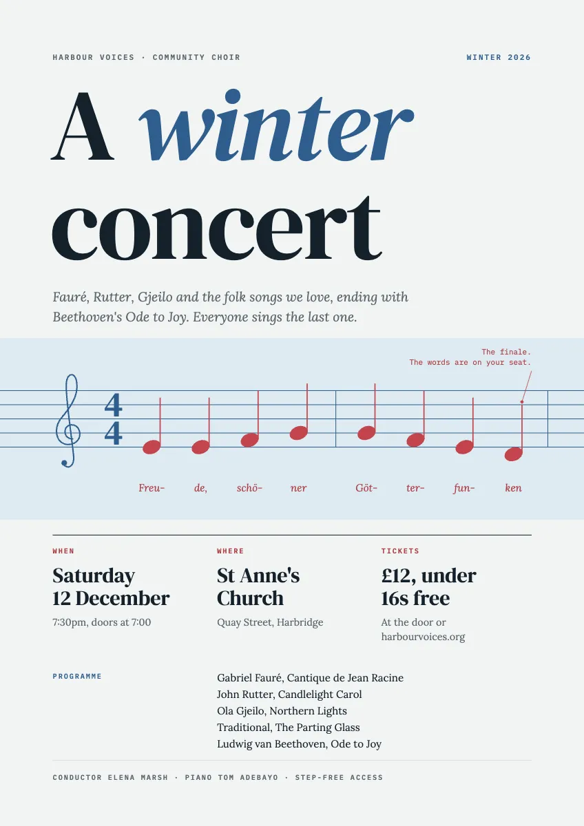
A choir poster with the first bars of the finale on a stave that runs off the page, and the date, place and price set large.
Free. It opens in the Motionix editor as your own copy.
Download the pictureWebP, 848 × 1200, free to use. To change the words or colours, open it in the editor.
- Size
- 1240 × 1754 px
- Pages
- 1
- Motion
- A still page; add motion if you like
- Category
- Posters and print
What it shows
- Music drawn from primitives
- Big display type
- Three facts on one grid
Good for
How to use it
- Open the template. It becomes a project in your account.
- Change the words, colours and pictures. Every part is an ordinary shape, line or text box.
- Add motion if it helps, then present it or export it.
What should a concert poster include?
A concert poster needs to tell people who is performing, what kind of music it is, when, where and how much tickets cost, and how to get them. Those few facts should be readable at a glance, with the programme, performers and access information in smaller type below. For a community concert, a strong image of the music itself often works better than a photograph of the performers.
When it helps
- A community choir advertising a winter concert in libraries, cafes and churches.
- A school music department promoting its end-of-term performance to families.
- A local orchestra putting up posters around town three or four weeks before a date.
- A shared image for social media that matches the printed poster.
Tips
- Always include the weekday with the date; people remember Saturday 12 December more readily than 12 December, and it catches typos in the date.
- Print a short website or QR code for tickets rather than a long address; nobody types a long link from a poster.
- Leave real empty space; posters fighting for attention on a busy noticeboard stand out by being calmer, not louder.
How to design a concert poster
Rank the information
Decide what reads first, second and third: usually the event name, then the date, place and price, then the programme and performers.
Pick one strong image
Choose one image that says what kind of music it is, such as a stave of a well-known tune, an instrument or a lit venue.
Set the key facts large
Put when, where and tickets on one grid in large type, with the weekday as well as the date and a ticket price or free entry.
Add the programme and credits
List the pieces and composers, the conductor or soloists, and practical notes such as step-free access, in a smaller size beneath the main facts.
Prepare it for print
Work at the final size, A4 or A3, with 3 mm bleed, images at 300 dpi and nothing important within a few millimetres of the trim.
FAQQuestions
Common questions.
What size is a standard concert poster?
A3 (297 x 420 mm) and A4 (210 x 297 mm) are the usual sizes for community noticeboards and shop windows, with A2 or larger for venue frames. Designing at A3 with a layout that still works at A4 covers most places a poster will go.
How far in advance should you put up concert posters?
Three to four weeks before the event is a common rule, long enough for people to plan and short enough that the poster still feels current. A reminder on social media in the final week helps catch people who saw it early.
What fonts work best on a poster?
A distinctive display face for the title and a plain, readable face for the details is a reliable pairing. Two typefaces are usually enough. Check that the smallest text is readable from a couple of metres away, which is where most people stand.
More posters and print templates
Menus, notices, invitations, signs and certificates.