Free templateOnline course thumbnail
Watercolour course thumbnail
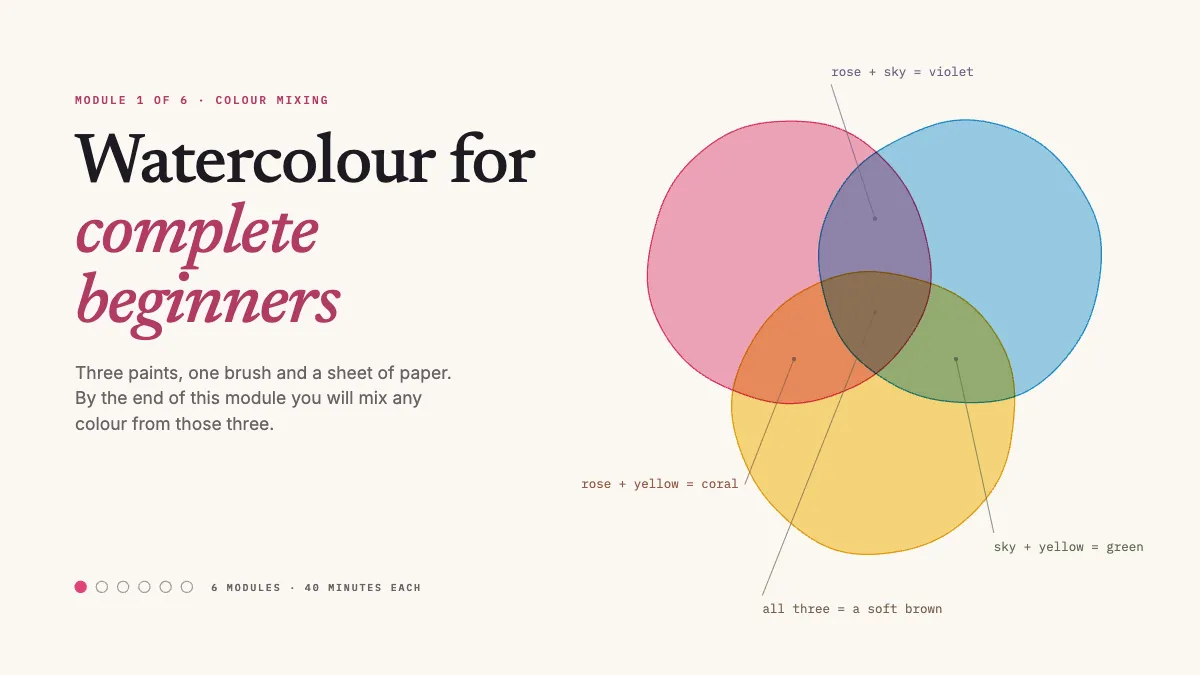
A course thumbnail where three transparent washes overlap and make their own mixes, each one labelled.
Free. It opens in the Motionix editor as your own copy.
Download the pictureWebP, 1200 × 675, free to use. To change the words or colours, open it in the editor.
- Size
- 1920 × 1080 px
- Pages
- 1
- Motion
- Yes, plays live and in GIF or video
- Category
- Covers
What it shows
- Multiply blending makes real mixes
- Washes that spread in
- Course progress mark
Good for
How to use it
- Open the template. It becomes a project in your account.
- Change the words, colours and pictures. Every part is an ordinary shape, line or text box.
- Press Play to watch it build, then present it or export it.
What is an online course thumbnail?
An online course thumbnail is the image that represents a course or a single lesson in a marketplace, a course platform or a video library. Most platforms use a 16:9 landscape image, often 1920 x 1080 or a smaller copy of it. It has two jobs: show a browsing student what they will be able to do, and look like part of a set so every module clearly belongs together.
When it helps
- Art teachers selling a beginners course on Udemy, Skillshare or their own website.
- Module images inside a course, each marked with its place in the sequence.
- A course trailer on YouTube that needs a cover matching the lessons.
- Showing the result of a lesson, such as three paints mixing, before a student enrols.
Tips
- For a practical skill, show real material or something drawn like it: a believable wash of paint beats an abstract graphic every time.
- Keep one design across every module and vary only the number and the subject, so students see a complete course rather than separate videos.
- Write the promise as an outcome, like mix any colour from three, not a list of topics. The syllabus reassures later; the outcome makes them click.
How to make an online course thumbnail
Show the outcome of the lesson
Students pay for a result. For a watercolour module, show three overlapping washes and the new colours they make, so the promise of the course is visible.
Name the course plainly
Use the words a beginner would search for, such as watercolour for complete beginners, rather than a clever title that only makes sense after enrolling.
Add a progress mark
A small module number or a row of dots showing where the lesson falls tells students the course is structured and helps them find their place again.
Leave room for platform badges
Course marketplaces add ratings, labels and progress bars over thumbnails. Keep the bottom edge and the corners free of anything essential.
Export at 16:9, then check small
Export at 1920 x 1080 and look at it at a fraction of that size, the way it appears in a grid of search results among competing courses.
FAQQuestions
Common questions.
What makes a good course thumbnail?
A clear picture of the result, a short title in the words students search for, and strong contrast at small sizes. It should match the course's other images and the promise of the first lesson, so students feel they have landed in the right place.
What size should a course thumbnail be?
Most platforms use 16:9 landscape images, so designing at 1920 by 1080 pixels and exporting smaller copies covers nearly all of them, YouTube included. Check each platform's upload page, since some, such as Udemy, ask for a specific smaller size like 750 by 422.
Why do three paints make new colours in watercolour?
Watercolour is transparent, so a wash laid over another lets light pass through both layers before bouncing off the paper. Each layer absorbs part of the light, which is subtractive mixing: rose and blue give violet, blue and yellow give green, and all three together give a soft brown.
More covers templates
Thumbnails, episode covers, banners and headers.