Free templatePodcast cover art
Podcast episode cover
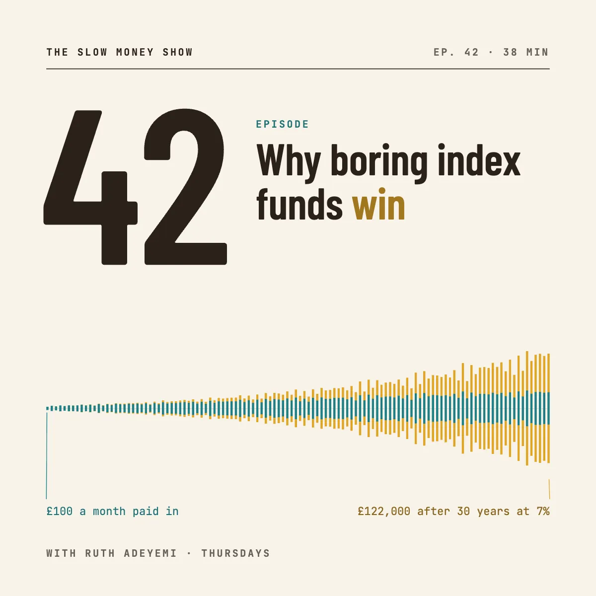
A weekly episode cover for a money podcast: a huge episode number and a waveform shaped like thirty years of compounding.
Free. It opens in the Motionix editor as your own copy.
Download the pictureWebP, 1200 × 1200, free to use. To change the words or colours, open it in the editor.
- Size
- 1080 × 1080 px
- Pages
- 1
- Motion
- Yes, plays live and in GIF or video
- Category
- Covers
What it shows
- Reusable weekly system
- Computed waveform
- Condensed numerals
Good for
How to use it
- Open the template. It becomes a project in your account.
- Change the words, colours and pictures. Every part is an ordinary shape, line or text box.
- Press Play to watch it build, then present it or export it.
What is podcast cover art?
Podcast cover art is the square image that represents a show, or a single episode, in apps such as Apple Podcasts and Spotify. Apple asks for a square between 1400 x 1400 and 3000 x 3000 pixels, recommending 3000, as a JPG or PNG. Episode art takes the same shape, and the best episode covers keep the show's layout fixed while the number and title change each week.
When it helps
- Weekly shows that want every episode recognisable in a feed, with a number big enough to scan.
- Announcing a new episode on Instagram or LinkedIn as a square post that matches the show.
- Finance or education podcasts where one small chart can hint at the episode's argument.
- Refreshing a show's look while keeping its name, colours and typeface familiar to listeners.
Tips
- Shrink the cover to the size of a list row in a podcast app. If the number or show name blurs at that size, enlarge it or remove something.
- Skip tiny guest photos and long subtitles; small, they become noise. Put guest names in the episode title and show notes instead.
- Use the same two colours every week and let only the number change. Consistency is what lets a listener find your show among dozens of squares.
How to make podcast cover art
Fix the show system first
Decide what never changes: where the show name sits, the typeface, the colour pair and the host line. Each weekly cover then becomes a matter of swapping the number and title.
Make the episode number huge
A big condensed numeral is the quickest thing to read at thumbnail size, and listeners working through the back catalogue use it to find their place.
Keep the title short
Five words or fewer hold up at small sizes. Set the episode title beside or under the number and highlight the one word that carries the point.
Add one graphic that argues
A waveform is the classic podcast motif. Shaping it to the topic, such as savings compounding over thirty years, lets the cover say something without extra words.
Export square at the right size
For podcast directories, export a 3000 x 3000 JPG or PNG in the RGB colour space. For social posts, a 1080 x 1080 copy of the same design is plenty.
FAQQuestions
Common questions.
What size should podcast cover art be?
Apple Podcasts asks for a square image from 1400 by 1400 to 3000 by 3000 pixels and recommends 3000. Use JPG or PNG in the RGB colour space. Spotify and most other apps accept the same file, so one 3000 pixel square serves every directory.
Do podcast episodes need their own cover art?
No. When an episode has no art of its own, apps fall back to the show's cover. Episode art is optional but useful for numbered series, guest interviews and clips, because it helps one episode stand out when it is shared by itself.
What should be on podcast cover art?
The show name, large and legible, plus one strong image or graphic that hints at the subject; many good covers also carry the host's name. Leave out taglines, web addresses and small print, none of which can be read at the sizes apps display.
More covers templates
Thumbnails, episode covers, banners and headers.