Free templateNewsletter header
Newsletter issue header
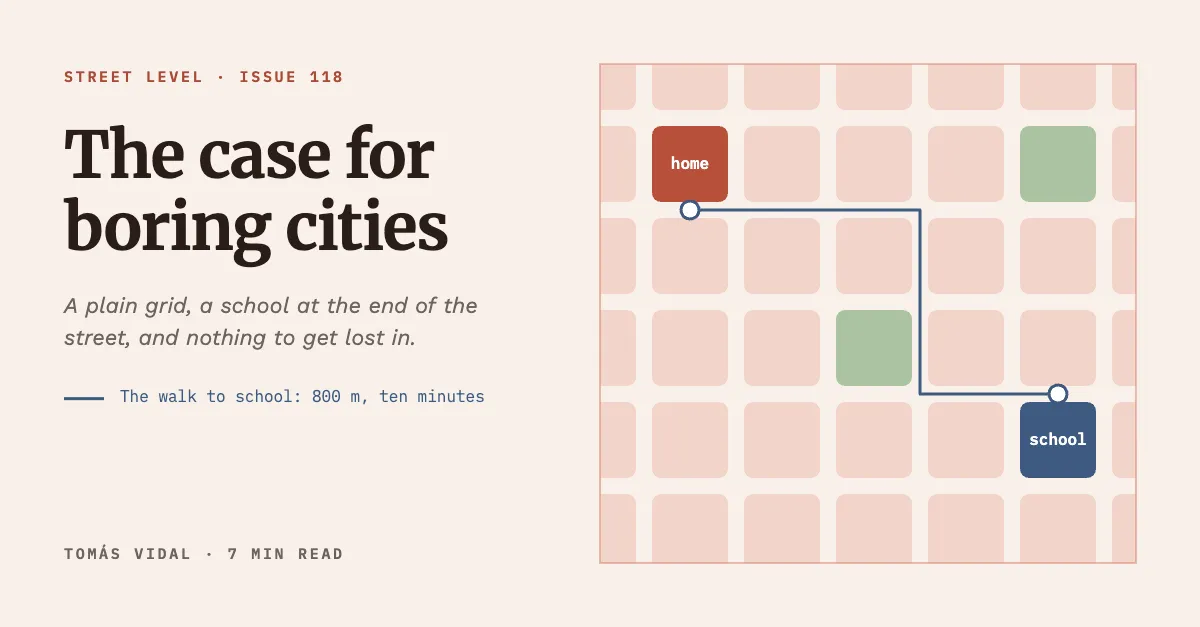
A header for a city newsletter: a plain street grid in hairlines, with one ten minute walk drawn across it.
Free. It opens in the Motionix editor as your own copy.
Download the pictureWebP, 1200 × 627, free to use. To change the words or colours, open it in the editor.
- Size
- 1200 × 627 px
- Pages
- 1
- Motion
- Yes, plays live and in GIF or video
- Category
- Covers
What it shows
- Street plan computed block by block
- One highlighted route
- Link preview size
Good for
How to use it
- Open the template. It becomes a project in your account.
- Change the words, colours and pictures. Every part is an ordinary shape, line or text box.
- Press Play to watch it build, then present it or export it.
What is a newsletter header?
A newsletter header is the image at the top of an issue that sets its tone and, when the issue is shared, becomes the link preview on social media and in messaging apps. Many writers make it 1200 x 627 or 1200 x 630 pixels, close to the 1.91:1 shape that LinkedIn, Facebook and X use for previews, so one image serves the email and every share.
When it helps
- Substack or Ghost writers giving each essay its own picture for the email and the share card.
- City or policy newsletters where a simple map or street plan hints at the argument.
- A weekly roundup that keeps one header frame and swaps only the issue title.
- Making an archive page look curated rather than like a list of plain links.
Tips
- Many email clients block images until the reader allows them, so never put the only copy of important information inside the header.
- Check the title is legible at the width of a feed card on a phone, since that is how most people meet a shared issue.
- Choose a small set of colours for the whole publication and reuse them on every header. A recognisable header style builds the brand more than a logo does.
How to make a newsletter header
Work at 1200 x 627
Use the 1.91:1 link preview shape so the header doubles as the share image. Keep text away from the very edges, since some apps trim them slightly.
Lead with the issue title
Set the title on one side at a readable size, with a one-line standfirst beneath it. The header is often seen before anyone reads the subject line properly.
Draw one idea from the essay
For an issue about walkable streets, a hairline street grid with a single highlighted walk to school says more than a stock photo of a skyline.
Keep the detail quiet
Draw background elements thin and pale so the title and the one highlighted route stand out. Fine detail still rewards a reader who looks at full size.
Set it as the social image
Most newsletter platforms let you upload a separate social preview image for each post. Use the header there too, then share the link privately once to check the preview.
FAQQuestions
Common questions.
What size should a newsletter header be?
For a header that is also the share image, 1200 by 627 or 1200 by 630 pixels works well. Inside the email itself, headers usually display at around 600 pixels wide, so make sure the title still reads at half size.
Should a newsletter have a header image?
It helps, though it is not required. A header gives each issue a strong link preview and a recognisable look in the archive. Plain text newsletters can work well too; if you skip the image, set a social preview image so shares do not look empty.
What is a link preview image?
It is the picture platforms show when someone shares a URL, read from the page's Open Graph image tag. Most use a landscape image near 1.91:1. If none is set, the platform guesses an image from the page or shows only text, which looks unfinished.
More covers templates
Thumbnails, episode covers, banners and headers.