Free templateMinimalist talk slides
Talk: five marathon lessons
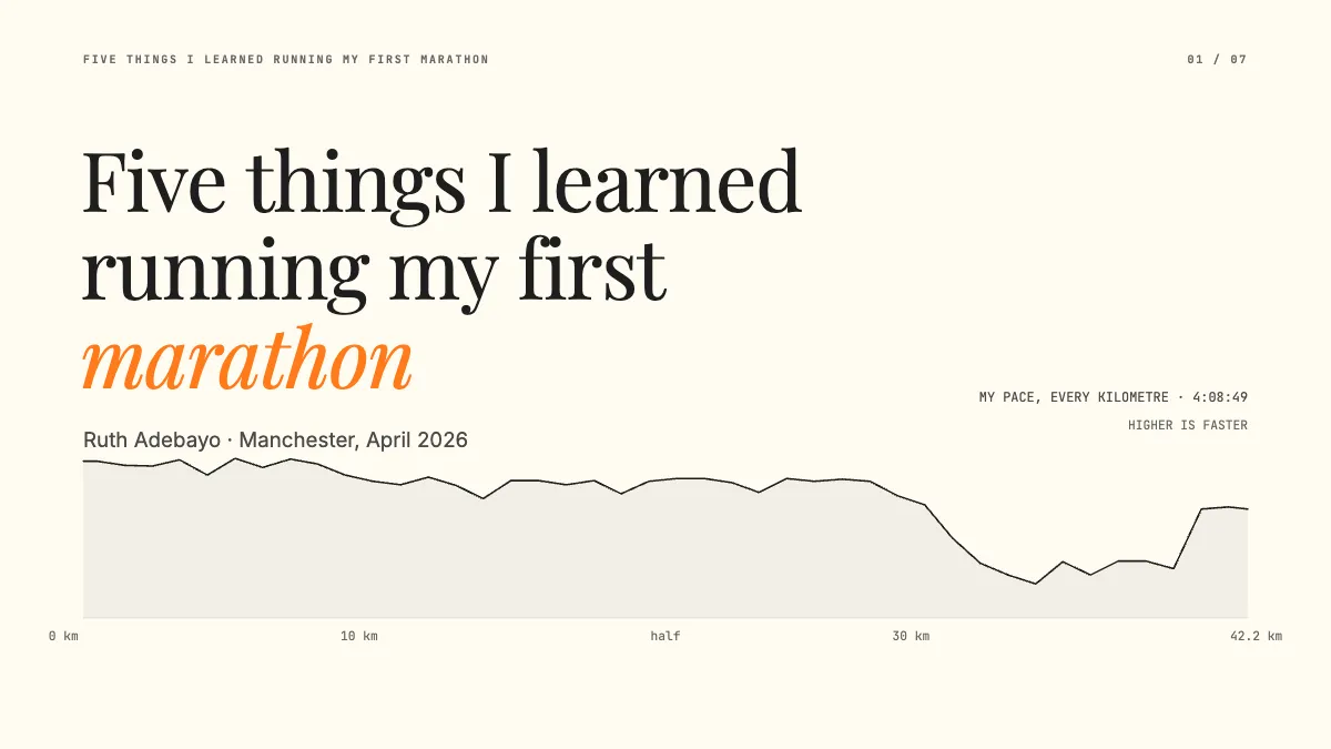
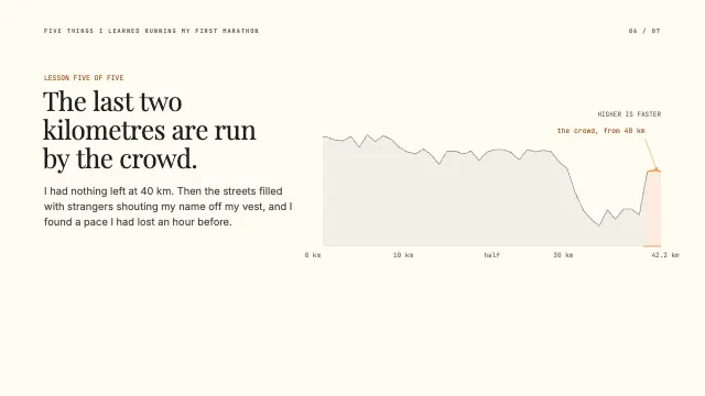
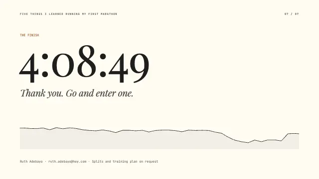
A seven-page talk, minimal and typographic, carried by one line: my pace for every kilometre of the race, lit where each lesson was learned.
Free. It opens in the Motionix editor as your own copy.
Download the pictureWebP, 1200 × 675, free to use. To change the words or colours, open it in the editor.
- Size
- 1920 × 1080 px
- Pages
- 7
- Motion
- Yes, plays live and in GIF or video
- Category
- Presentations
Every page
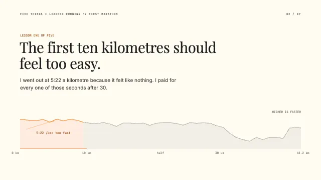 Page 2
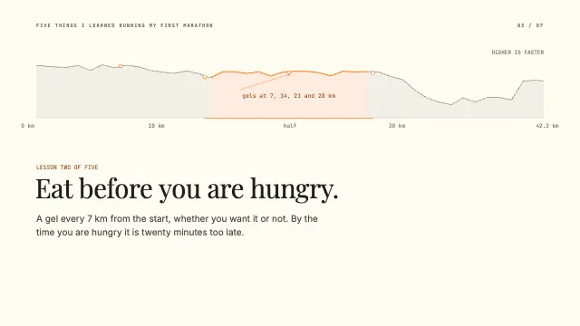 Page 3
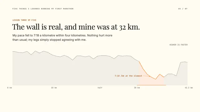 Page 4
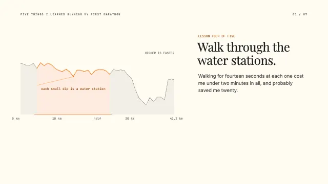 Page 5
 Page 6
 Page 7
What it shows
- One computed line as the motif
- A different layout on every page
- Big type, few words
Good for
How to use it
- Open the template. It becomes a project in your account.
- Change the words, colours and pictures. Every part is an ordinary shape, line or text box.
- Press Play to watch it build, then present it or export it.
What are minimalist talk slides?
Minimalist talk slides use very few words, large type and one image or idea per slide, so the speaker carries the talk and the slides only punctuate it. The style suits personal stories, keynotes and lightning talks, where the audience should watch the speaker rather than read. A single recurring visual, such as a line of race pace, can hold a whole talk together.
When it helps
- A meetup lightning talk of five to ten minutes about a personal experience.
- Conference keynotes built around a story rather than a dataset.
- Sharing lessons from a hobby, like running a first marathon, with a club.
- Ignite or Pecha Kucha nights, where the slides advance automatically.
Tips
- Set type large enough to read from the back row; if a line will not fit at that size, it is too long for the slide.
- Leave empty space on purpose. A slide with a few words and plenty of room tells the audience to look at you.
- Keep your notes in presenter view, never on the slides, so the audience sees the idea and not your script.
How to make minimalist talk slides
Write the talk first
Draft what you will say before opening any slide software, then decide where a slide would help. Many slides in a minimalist talk hold only a few words.
Choose one visual motif
Pick one image that can return in different ways, such as your pace for every kilometre, lit up where each lesson happened.
Put one idea on each slide
Each slide should be a single statement, like eat before you are hungry, set large enough to read from the back of the room.
Vary the layout, keep the system
Change the composition from slide to slide to hold attention, but keep the same fonts, colours and margins so it still feels designed.
Rehearse with the clicker
Practise with the slides until each change lands on the right word. In a minimal talk, the timing of each reveal is half the effect.
FAQQuestions
Common questions.
What is a minimalist presentation?
A presentation that removes everything not essential: few words, large type, generous white space, one idea per slide and a restrained palette. It relies on the speaker for the detail, so it suits talks that have been well rehearsed.
How many words should be on a slide?
For a minimalist talk, often fewer than ten and sometimes only one or two. Teaching and reference decks need more, but any slide the audience must read while you speak competes with you for their attention.
What is a lightning talk?
A very short presentation, usually about five minutes, given at meetups and conferences, often several in a row. Ignite talks use 20 slides that advance automatically every 15 seconds, and Pecha Kucha uses 20 slides shown for 20 seconds each.
More presentations templates
Decks for pitches, lectures, reviews and talks.